Portraiture.
|
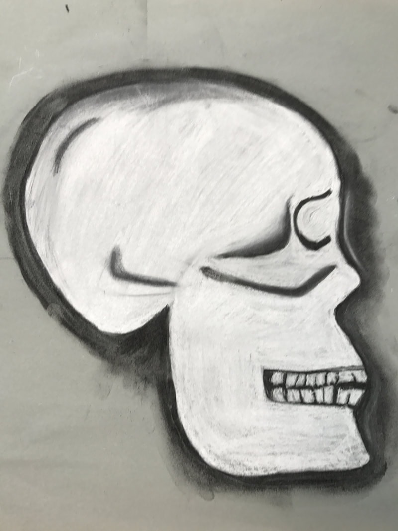
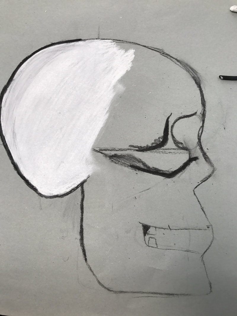
Skull drawing.
|
|
Eye drawing
|
After learning how to draw what is on the inside of a human body we needed to practice drawing the important features of the face like eyes, noses, mouth...ect.
|

|
Looks like, is like...
13.09.2017
Is like...
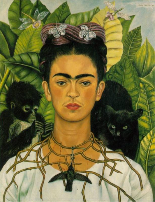
This self portrait is called "Self portrait with thorn necklace and hummingbird". It was painted in 1940 by a painter Called Frida Kahlo. Frida Kahlo was a Mexican painter who mostly painted portraits inspired by the Mexican culture and society, Kahlo explored and reflected the identity of Mexico, such as race, class and gender, in her paintings. As I was looking for portraits which reflected emotions and feeling this one caught my eye as she is surrounded by nature, one of the most beautiful creations, yet making it seem dark and scary. In my project I would like to show emotions instead of only appearance therefore I can relate this to my future project, furthermore I like the idea of the background reflecting other stories and emotions. When I first saw the image I thought that it was very shocking as we have things we associate we good and thing we associate with wrong. For that reason I thought it would be interesting to explore as it probably reflects a time in her life. The first part of this painting I noticed was the thorn necklace which seemed to be choking and hurting the artist, therefore it stood out to me as I would like to research what triggered the feelings of the painter. I associate this painting with death as there are harmful things surrounding the painter, and also because there is a dead hummingbird hanging from the thorn necklace.
The artist is Frida Kahlo (1907 -1954) was a self portrait artist , she lived in Mexico her whole life even though she exhibited her art work in Mexico and Paris. She was and is still considered one of the most important feminist icons in Mexico. Kahlo began to paint after she got seriously injured in a bus accident in 1925, during her recovery she painted and a year later she finished her first self portrait, which she gave to Gomez Arias as he was with her when the accident happened. In her work, Kahlo, liked to show Mexicos culture as well as painting for her friends or to show a tragedy that had happened. For example she got asked to paint a portrait of her friend that had committed suicide earlier that year. Frida Kahlo did not consider herself a surreal artist even though the art of that period of time was modern making it very colourful and unrealistic, she decided to make her art work stand out. Frida had an exhibition in 1938 where she presented 25 portraits and sold more that half of them, in her lifetime she painted 143 painting, and 55 of these were self portraits. What she likes to do with her work is show the culture of Mexico and give emotions and feeling to her audience. I like how she choses to present her work, it appeals to the audience in different ways but all with the same meaning behind it. The technique of having a background that is not one solid colour softens the impact of the portrait as it distracts the attention from the painter and gives you the chance to explore it.
In this painting there are various things going on. We can see a tiny bit of the sky in the background covered up by lots of leaves and nature, next there are two main animals and two smaller and finally we have Frida Kahlo with her Thorn necklace and the hummingbird, which is the main focus of the painting. There is a story behind this painting she made in 1940. She painted this portrait after her divorce with Diego Rivera and the end of her affair which Nickolas Muray who was a photographer. Therefore people believe that the thorn necklace is showing the pain she was going through. Funnily enough this self portrait was bought by one of her ex-lovers whom she was having the affair with, Muray. The thorns and the hummingbird create a contrasting image because in Mexico a humming bird is a sign of hope and good luck there for she is is showing that even though she is hurt she still thinks there is hope. However the black cat could represent her ex-husband, which looks as if it's about to pounce therefore in this painting there are many different and contrasting ideas that show her confusion and depression at the time. The main focus is Kahlo in the painting however we see other things which could represent different people or situations in her life, like I mentioned before the cat is her ex-husband however other people could argue that it's the monkey as it is the one holding the thorn necklace making Kahlo bleed, suggesting he is creating the pain. I would argue that the painter has used colours descriptively as she has not used any unusual or out of place colours. Her eyes are looking down showing the disappointment in her face, the way that Kahlo has decided to make her look down gives away that she is sad because otherwise her facial expression is neutral, therefore I think that she decided to keep herself normal and make the surrounding explain and represent her problems because there was probably to much going on to show in one facial expression.
In conclusion I think that this self portrait is very effective and clever because she looked at different ways of representing a problem.
Bibliography
Biography.com Editors. (2017, July 6). Frida Kahlo. Retrieved September 11, 2017, from The biography website: https://www.biography.com/people/frida-kahlo-9359496
Puchko, K. (2015, June 1). 15 Things You Should Know About Self-Portrait with Thorn Necklace and Hummingbird. Retrieved September 10, 2017, from Mental Floss website: http://mentalfloss.com/article/64204/15-facts-about-frida-kahlos-self-portrait-thorn-necklace-and-hummingbird
wikipedia. (n.d.). Self-Portrait with Thorn Necklace and Hummingbird. Retrieved September 11, 2017, from Wikipedia website: https://en.wikipedia.org/wiki/Self-Portrait_with_Thorn_Necklace_and_Hummingbird
Looks like...
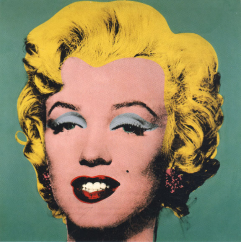
This portrait shows what Marilyn Monroe looks like because we can clearly tell that it's her. It was made by Andy Warhol in the 1950s and it's called 'Portraits of Marilyn Monroe. The reason why it's in plural is because they made many copies in lots of different colours and shades. I have chosen to analyse this portrait because it stands out and will appeal to an audience due to the use of bright pop art colours. I also like this style of art because you can easily see what is going on in the picture and the shapes are simple. This is relevant to what I'm aiming for in my final piece because I would like to use colours that stand out making my art appeal to all type of people. I have seen this picture many times before and every time I look at it, it reminds me of how much style and art has changed and developed until today. Pop art makes me feel good because it looks modern and fun, it would be art that I would like in my house to give it a pop of colour.
The artist who illustrated this painting is called Andy Warhol (1928-1987). He lived and created his work in New York most of his life even though he was born in Pennsylvania. He made illustrations of modern and pop art, for that reason people say that he was a big part of moving pop art into America and helping it become more famous and popular in all the world. Warhol liked to experiment with colours to see if he could create different sensations and feelings depending on the colour he uses. What Andy Warhol liked to do was to make his art about something or someone everyone knew so that he had a way to get an audience. In the 1940s the style of art was mainly art deco which is quite similar to pop art as it uses clear and sharp images and drawing, art deco and Andy Warhol were the start of pop art and had a major influence in it as it started in the 1950s but became well known in 1960s. The intention of Warhol's work was to make his audience recognise the image portrayed immediately, but react with different feelings and emotions depending on the colour choice he used. For that reason he would normally make the same illustration in different colours and shade to show different emotion. For example there is one illustration which is quite unusual as he makes all the colours darker than they are supposed to be conveying certain emotion that make you feel miss placed or confused.
This illustration is called 'Portraits of Marilyn Monroe'. There are many different illustrations he made all using the same picture but in general they don't have specific names. Andy Warhol focuses a lot on colour in his work and he likes having only one thing going on so that there is one clear message. Even though this specific art has no message as in what it is like you could argue that if I had chosen one of the pieces of art where there are multiple copies in different colours it could suggest what Marilyn Monroe is like because she always looks happy but all the colour might show emotions and events. However because I am analysing what this looks like I chose only one single illustration. The fact that there is nothing going on in the background focuses the attention to Marilyn Monroe as she was a very important actress in America at the time. Furthermore this illustration out of all show what she looks like the most as the colours are the same as what she looks like in reality. In pop art the shapes are outlined and easy to distinguish. The background is dark green which is related to nature but most importantly growth and money, this related to Marilyn Monroe as she was growing a lot in the acting industry and gaining a lot of money.
In conclusion I think that this image is powerful because there is not a lot of things going on there for most people will view it the same way and immediately recognise that it is Marilyn Monroe.
Bibliography
Andrew E. (2017). Andy Warhol’s Marilyn Monroe Series, 1967. Retrieved September 12, 2017, from Masterworks fine art website: http://news.masterworksfineart.com/2017/06/27/andy-warhols-marilyn-monroe-series-1967
The art story foundation. (2017). Andy Warhol. Retrieved September 12, 2017, from The art story website: http://www.theartstory.org/artist-warhol-andy.htm
Smith, S. (Ed.). (n.d.). Andy Warhol’s Marilyn Prints. Retrieved September 11, 2017, from Colour vision & art website: http://www.webexhibits.org/colorart/marilyns.html
|
Mixing paint to create tones and colours.
|
Abstract Art- Peacefulness, illness, joy and anger.


My abstract art describing a person.
20.9.2017

Photography
27.9.2017
Statement of intent.
|

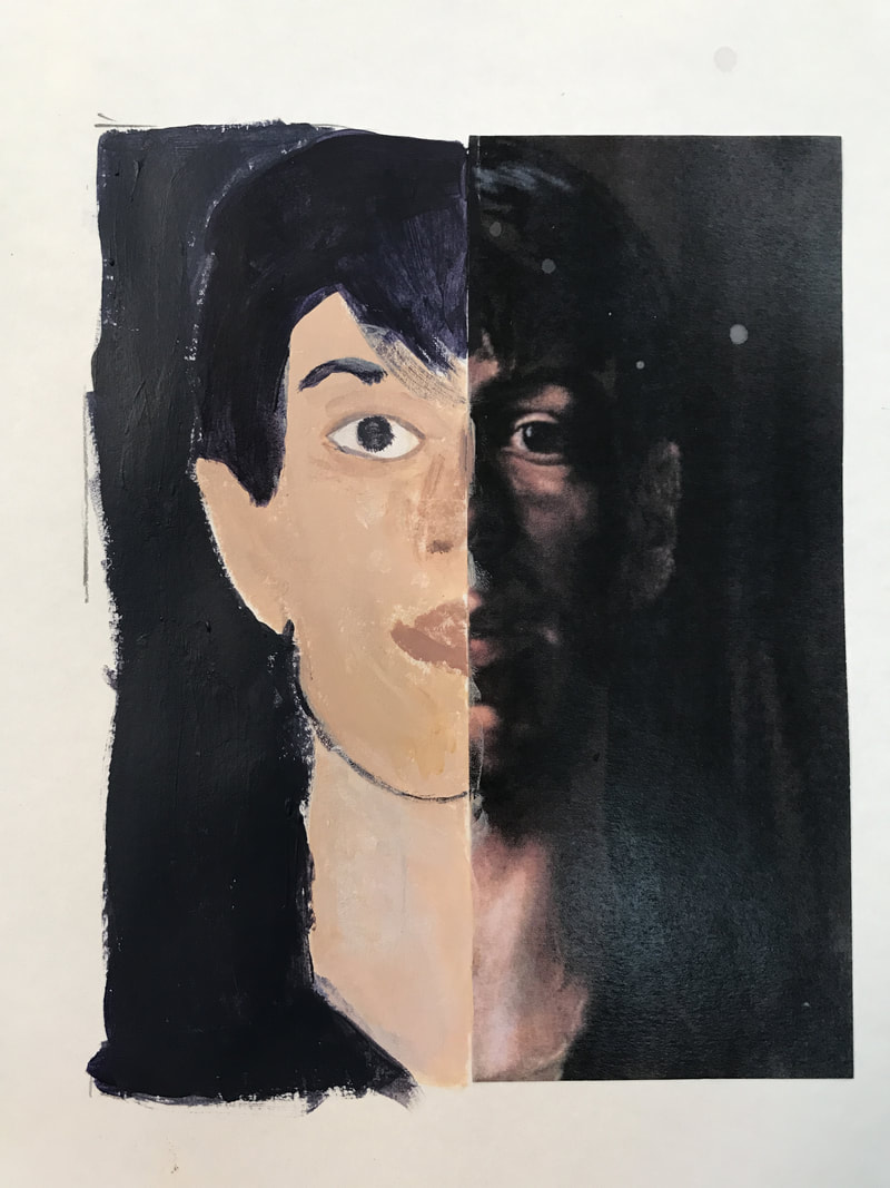
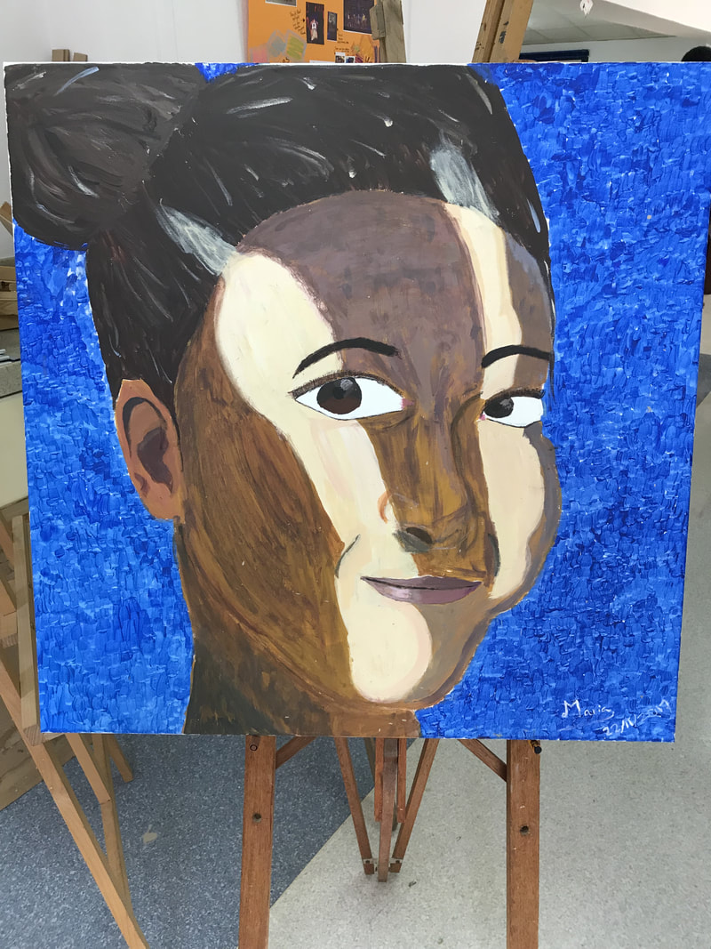
My drawing will be of Lara. I will be drawing a portrait that will show her appearance. That's why I am planning to make the background blue but with quick and small brush strokes to create a sense of mystery and her being a wild and curious person. I will mix different tones of blue and add dabs of white to create a more dimensional vibe and make the painting look like there is something further to be uncovered. Furthermore it show that Lara likes the outdoors and nature as the colour blue has connotations of the sea and the sky. I will draw the shadows and different colours and tones to add the the sense of mystery this might look odd when I start drawing but eventually I hope that it will all come together and look like one. The hair will be one main colour but I would like to make it more exciting by adding strokes of colour and in that way defining the hair and giving it the extra colour and detail. |
Process...
16.10.2017


Last lesson I started working on a canvas. I drew a grid and I started tracing out the picture, the grid help me to get the shapes and sizes right. This lesson I would like to complete the background colour, and start the hair so that I can move onto details next lesson. If I complete this, it will be a sign of me working on time.
|
|
In these pictures you can see the process of me making the face. The first thing I did was the outline the main features of the face and I tried to get a sense of where everything should go and how big everything should be, it was hard to get a sense of the scale turning out well because I was painting on a big canvas which means that everything got enlarged therefore I thought that some parts looked unrealistic and unnatural however once everything was put together and I took a step back from my painting I could see how it was coming together and that it looked normal. I was painting from a picture I took |


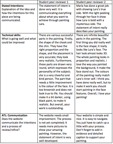
Reviews from 2 students
7.11.2017
Final piece!!
|
Reflection...
|
When painting I felt many insecurities because I thought it was way to big.I general I am happy with my final piece. I think I got the statement of intent fairly well and I made the facial feature look accurate and similar to the picture but added my own differences, like the background. I like that the face is the main focus because it is so big, this also made it confusing when I was actually painting it because everything looked unnatural as it was so big, therefore when painting I felt many insecurities because I thought it was way to big, I learned that you have to take a few steps back if you want to clearly see how it is coming together and the colours coordination.
I would say that my statement of intent was well reached however I would have to ask other |
|
